(School project for Digital Design Class)
Task: come up with a concept for a magazine, design the magazine's masthead,
give the magazine three issues, and create designs for the magazine covers.
DSGN is a magazine that covers what design is, what good design is, how to make good design, and how to earn from making good design. Each issue focuses on a major element of design- line, color, and shape.
Articles are about studying the meaning behind certain design solutions, taking inspiration from works of different design legends, and how to’s on improving one’s design works. This magazine aims to inform and inspire- talking about the basic design elements and showing different ways of using them. DSGN brings the readers the what, why, and how of design.
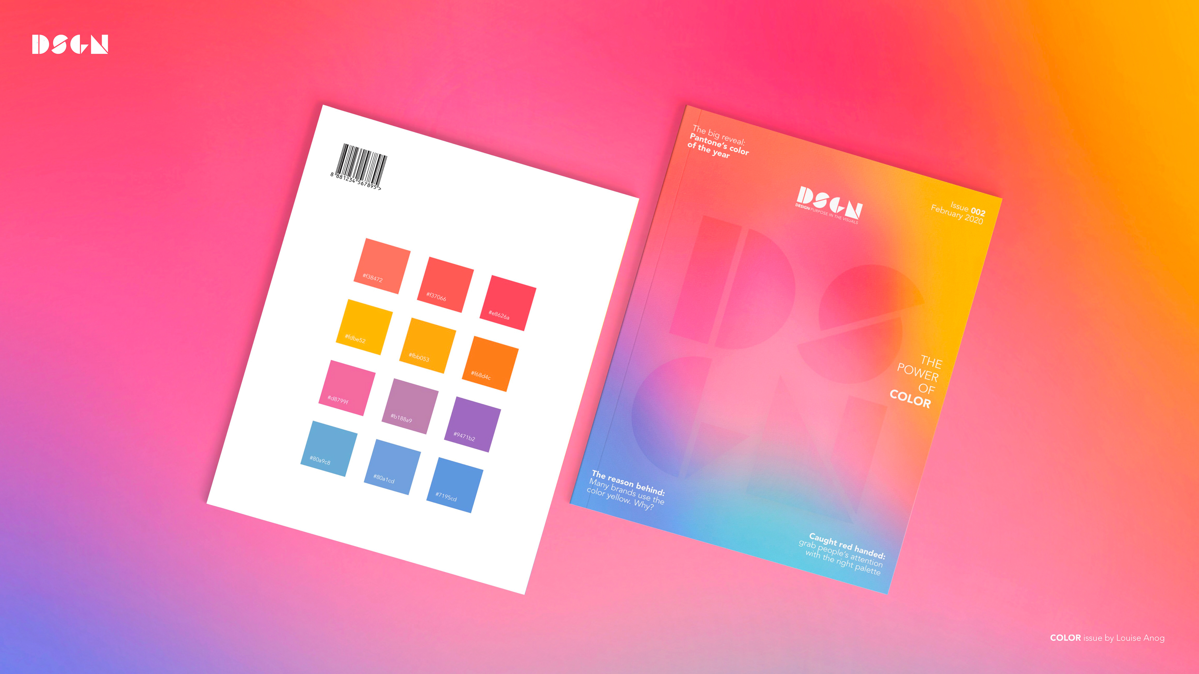
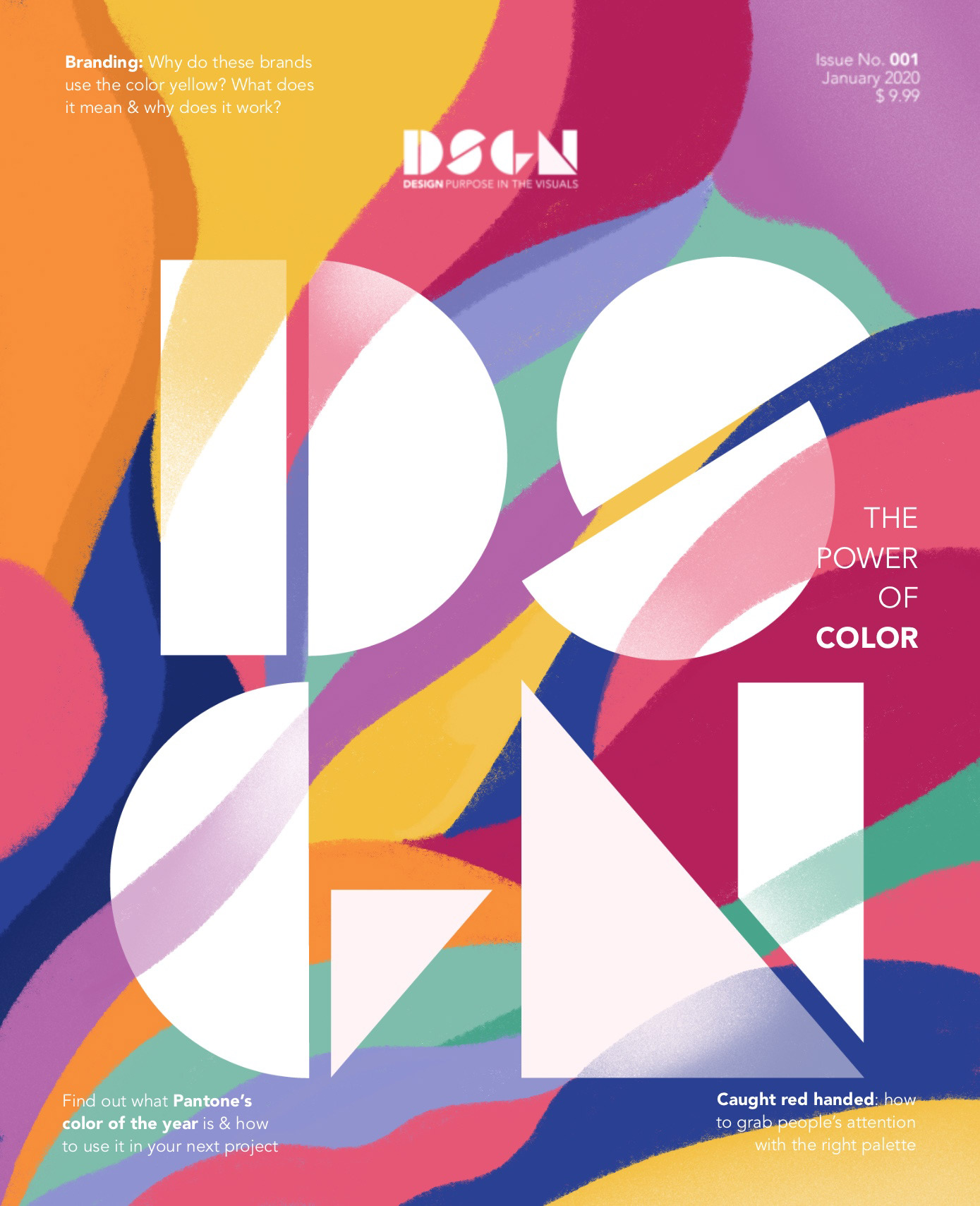
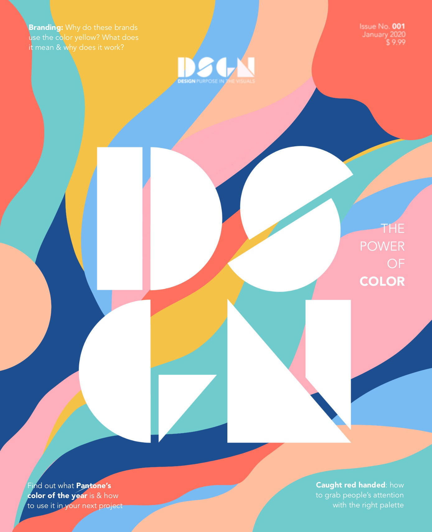
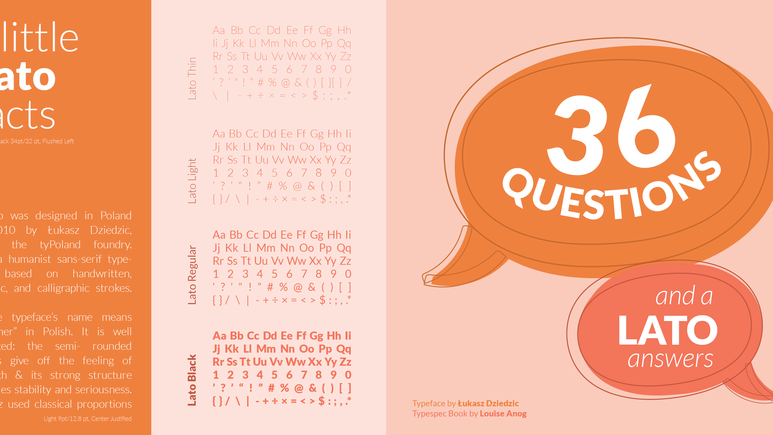
The issue assigned to me was COLOR.
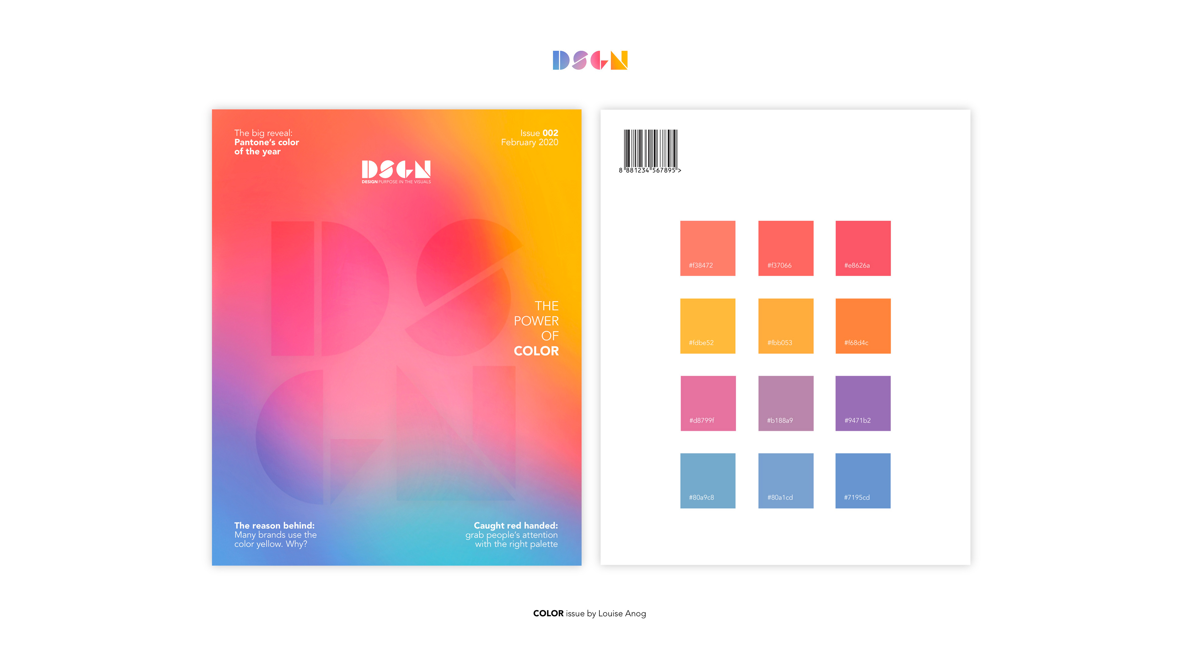
For my cover, I included shades of the primary colors (red, blue, and yellow) but not the super vibrant and ordinary kind. I wanted it to look pleasing to the eye, something that will interest the audience. It has to clearly communicate color, nothing else. I played around with gradients and want it to portray the power of color. I made the DSGN blend in with the gradient.
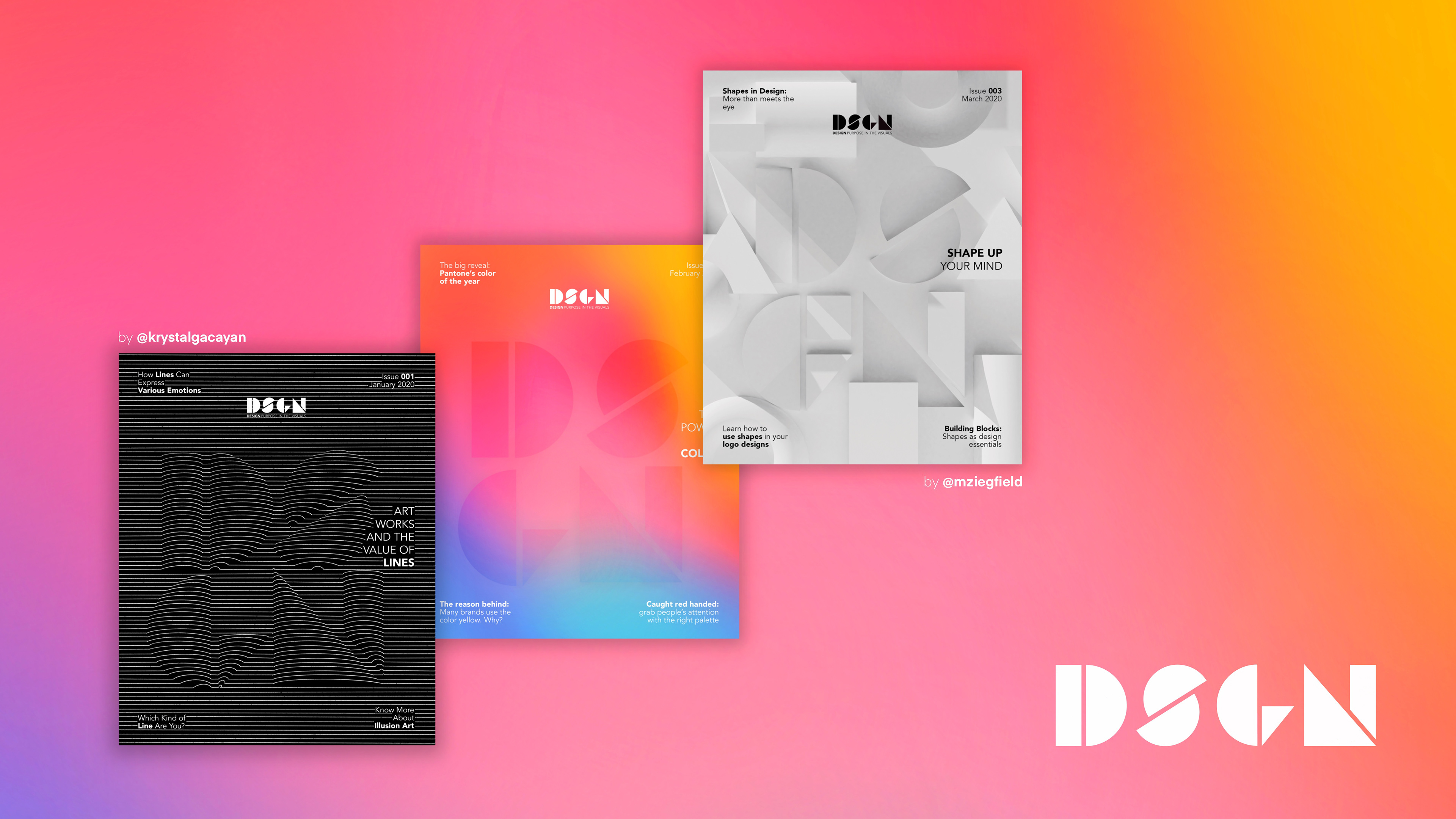
LINE issue cover design by Krystal Gacayan
COLOR issue cover design by Louise Anog
SHAPE issue cover design by Mygel Edoloverio
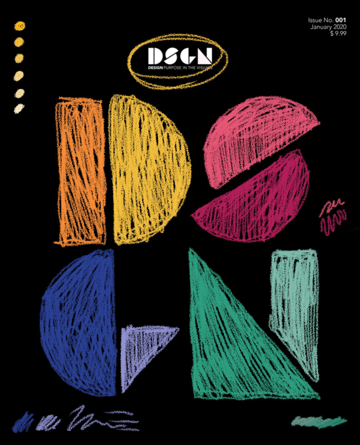
For our front cover layouts, we wanted the DSGN masthead to be enlarged. The DSGN is “hidden” in our covers, because each of our covers: line, color, and shape, they are elements of design. They are the building blocks that make design what it is, so we wanted to translate that by having the DSGN on our cover images. Our back cover contains the “ingredients” for our front cover image. For color, we have the swatches. For line, we have the lines used.
And for shape, we have the shapes that were show in the front cover!
We made our layout to be simple and smart - just like design.
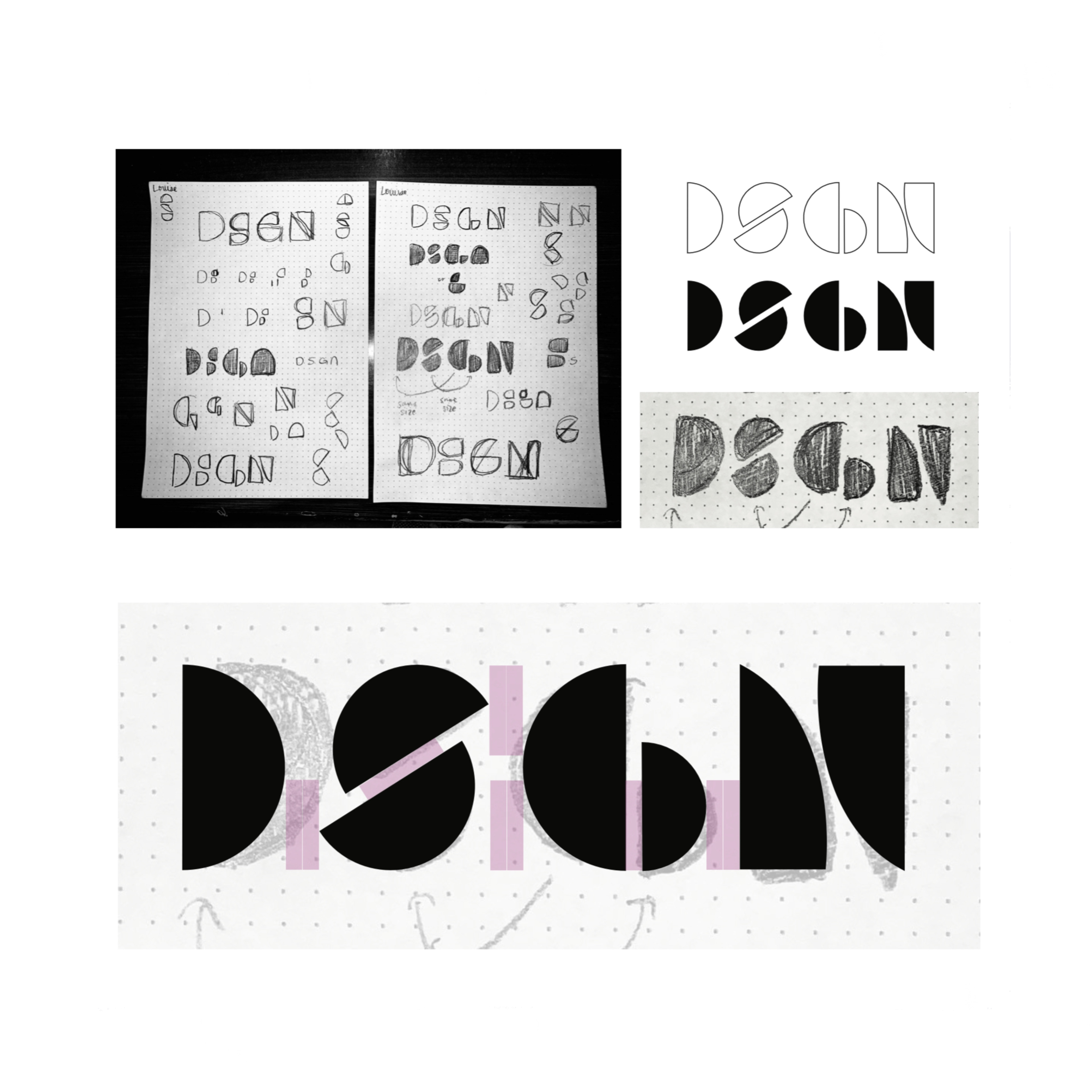
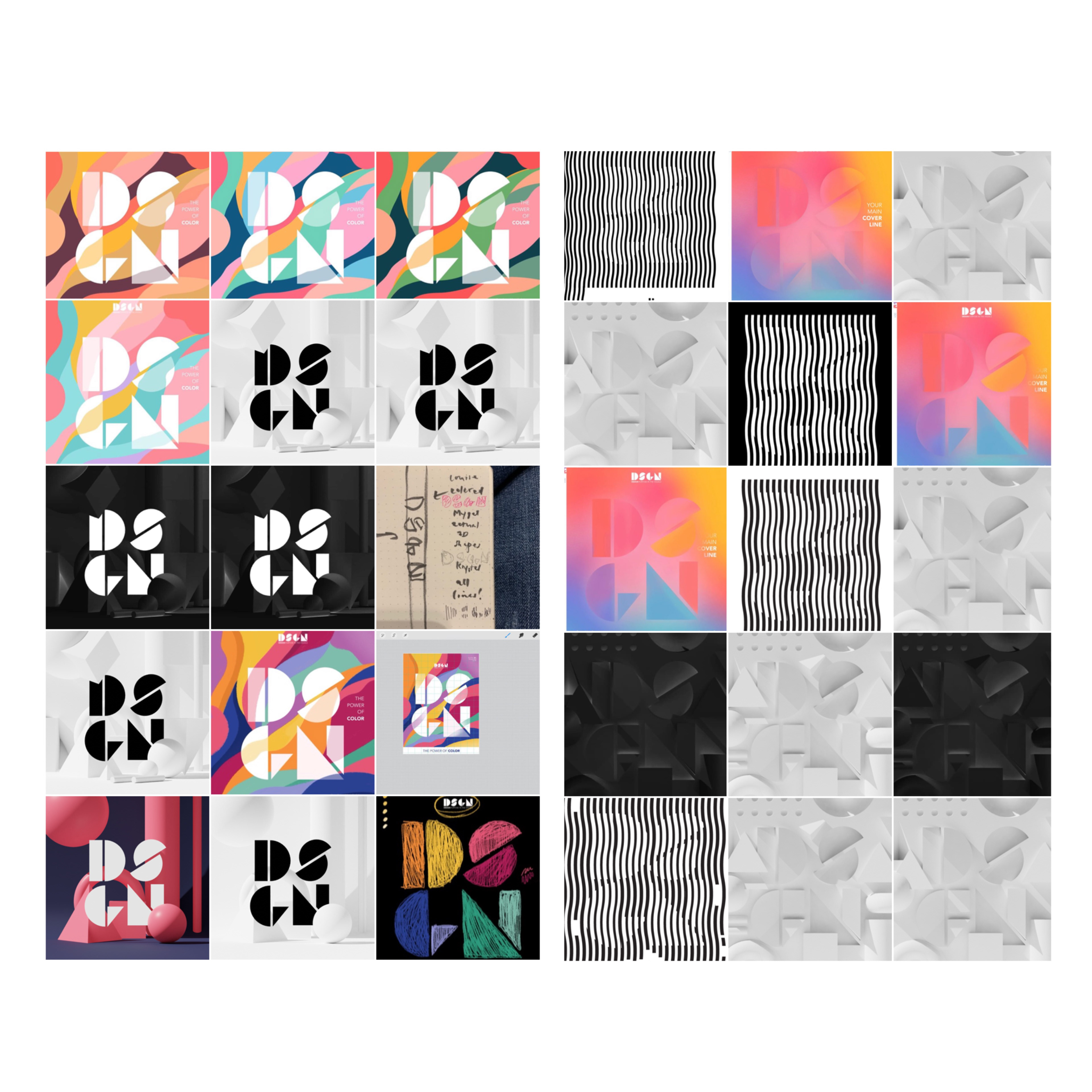
Progress of our group's brainstorming of ideas, designing the masthead, and earlier studies of my COLOR issue.
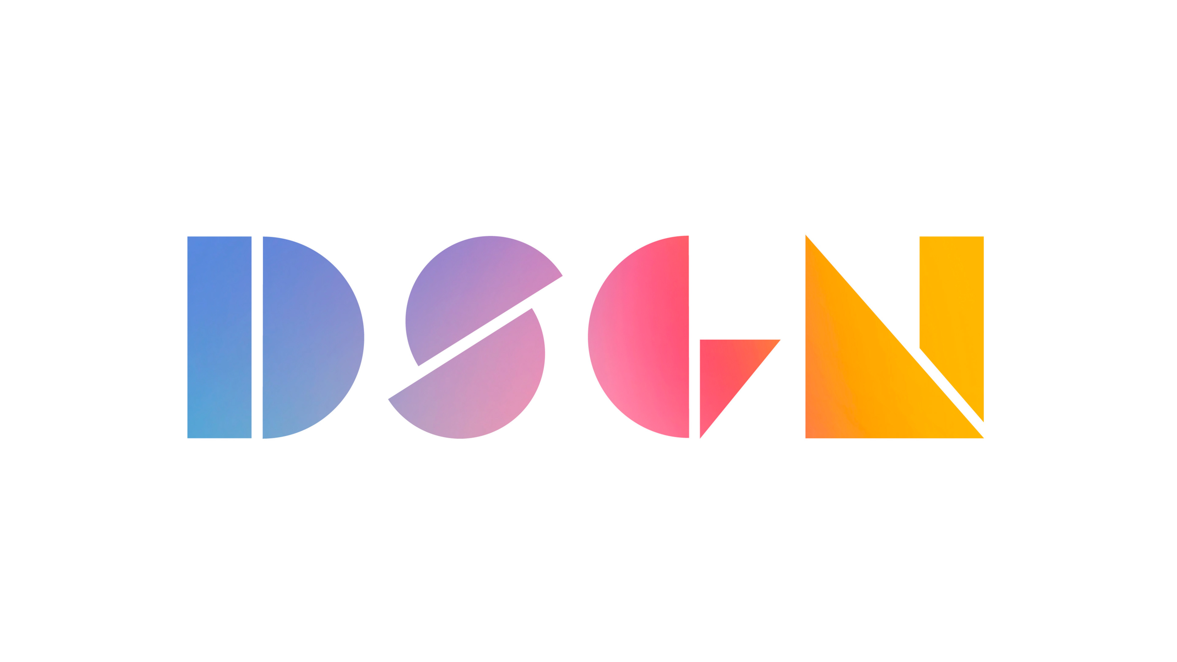
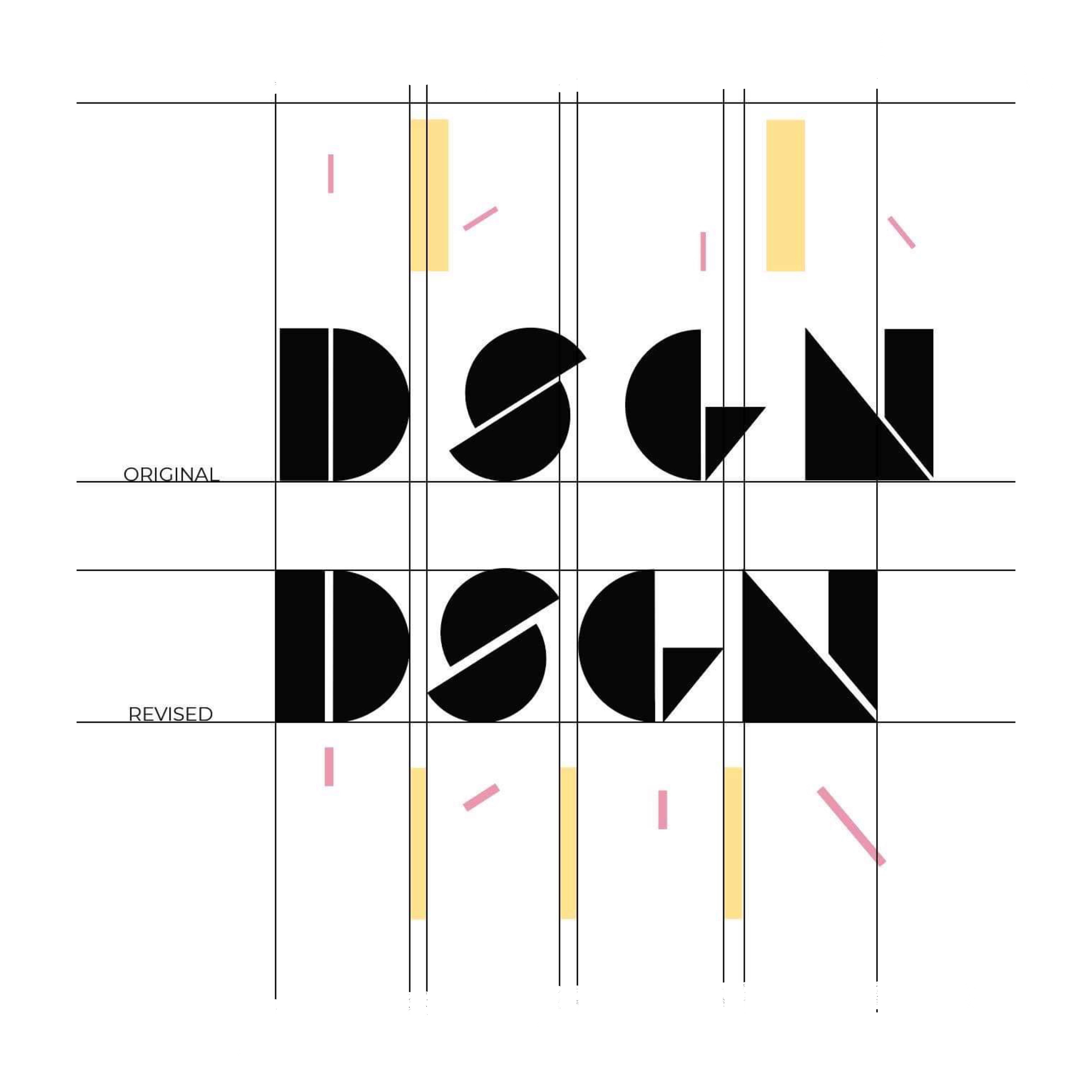
For our masthead, we wanted it to be bold and strong. We avoided using a typeface, and instead, explored to create our own. We deconstructed the letters into shapes using the three basic shapes- the rectangle, triangle, and circle.
Our whole group experimented with different ideas for the masthead.
In the end, my design was the one used in the final magazine covers.